|
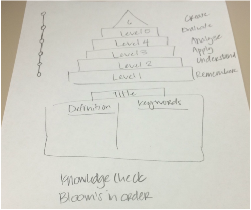
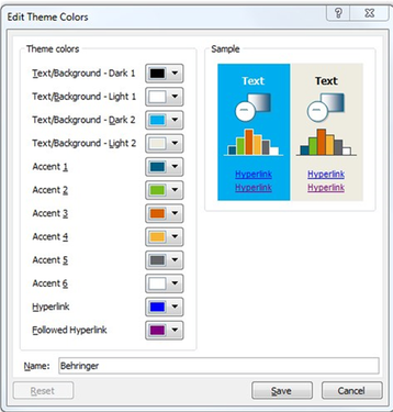
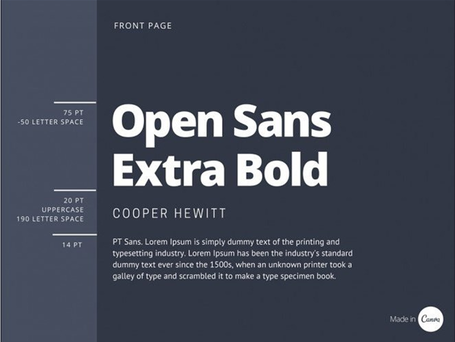
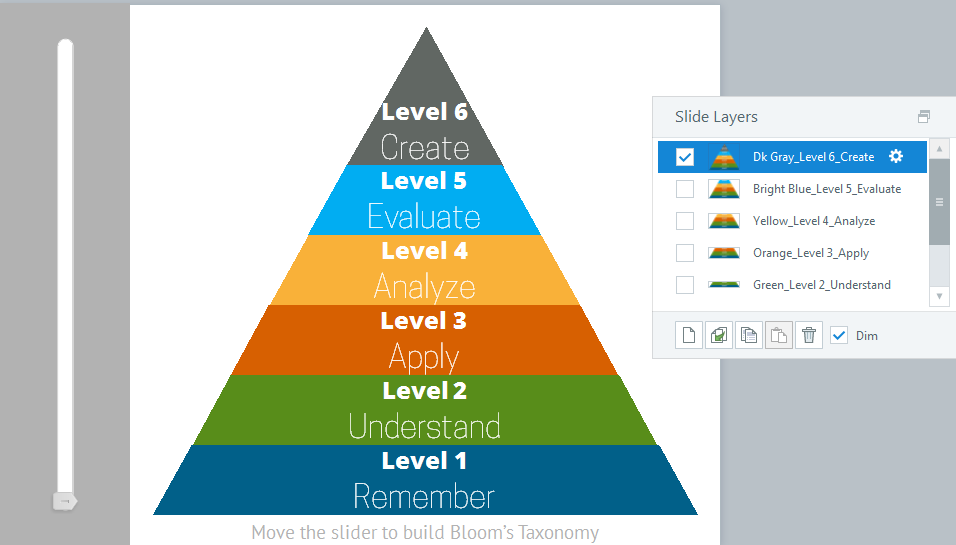
Sometimes when suffering from designer’s block on a project, it is good to get away from the task at hand and recharge your ID batteries in other ways. I find it therapeutic to seek out inspirational design, blog articles, and of course elearning heroes challenges. After upgrading to SL2 late last year and working through work-related courses, I hadn’t yet had the opportunity to test out the new interactive sliders feature. While reading an eLearning Guild research e-book on writing assessments, their illustrations on Bloom's Taxonomy captivated me and gave me an idea. My idea was to create Bloom’s Taxonomy and introduce an interactive slider that would build the infamous triangle. Starting from a hand drawn concept of the course (see below), I first needed to learn how to add a slider to my course. Articulate’s slider tutorial did the trick. Next up was figuring out the color scheme. One SL2 feature that I absolutely adore is the eyedropper tool. I already had a color palette saved in PPT that I wanted to use. I simply pulled up the color theme editing (see below), copied it and pasted it into my course. From there, I opened the color theme editor in Storyline and used the eyedropper tool to replicate the same exact colors from my PPT theme. Since a theme of this course creation seemed to be teaching myself new tricks, I wanted to test out some font pairings. With a quick google search, I found Canva’s Ultimate Guide to Font Pairing—Perfect! After scrolling a little way through, I settled on design #7 (see their rendering below) I went to Font Squirrel and downloaded and installed the fonts: Open Sans Extra Bold, Cooper Hewitt, and PT Sans. With my bold color palette and font pairings all selected, I set out to build a triangle. I tried and ultimately failed at building it in the most efficient manner I thought possible. I built my layers slowly, trying not to duplicate efforts. I’d add the piece of the triangle needed for that layer and then I’d duplicate the layer. I used slanted lines to angle the shapes properly. In the end, that method resulted in lots of copying and pasting of triangle pieces on several layers as I struggled to match the taper. The biggest issue ended up being the triangle on the very top of the triangle—it simply didn’t match with the deconstructed triangle. After much time, I finally realized I could create a right triangle shape and build each individual piece to match that angle and proportion; MUCH easier. I set up the slider to show each layer when the slider was moved and the result turned into what I think to be a fairly elegant triangle with a lovely slider feature. I adapted the text from the eLearning Guild e-book to the slides (and of course gave them credit). Recently on my own skill development quest, I’ve also been focusing on using slide masters and placeholders more.
I hope you enjoy the final version as much as I enjoyed creating it. Click on the image to view the demo.
Comments are closed.
|
AuthorHi my name is Kimberly Valliere and I'm an experienced Leader, Instructional Designer, eLearning Developer, LMS Administrator; lover of technology, Articulate Storyline, pictures, and learning. (Certainly not an exhaustive list.) Archives
July 2023
Categories |

 RSS Feed
